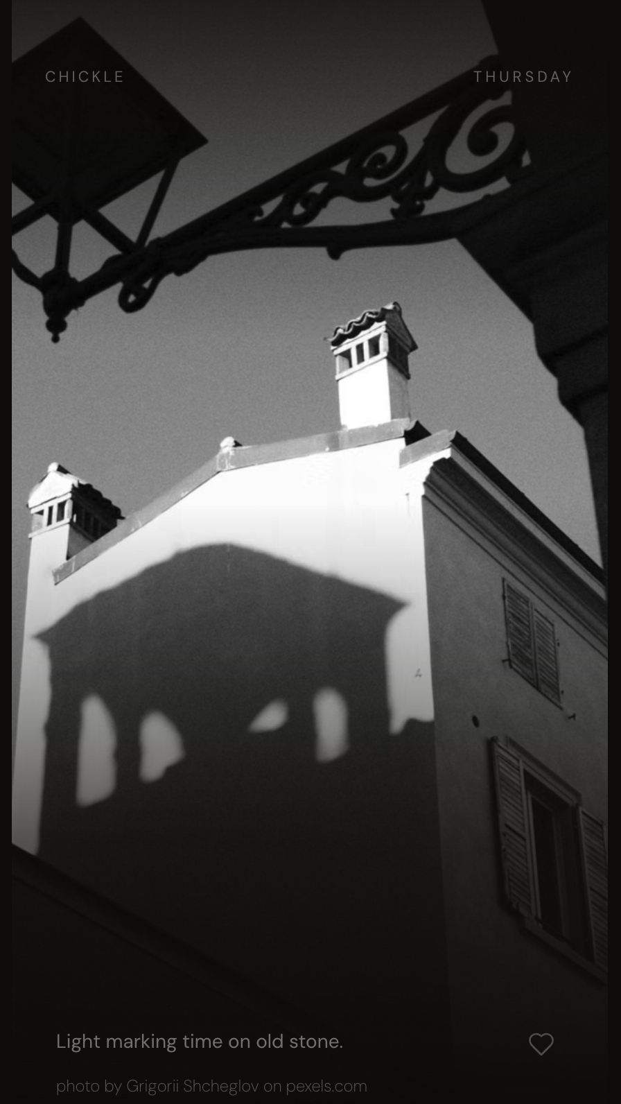
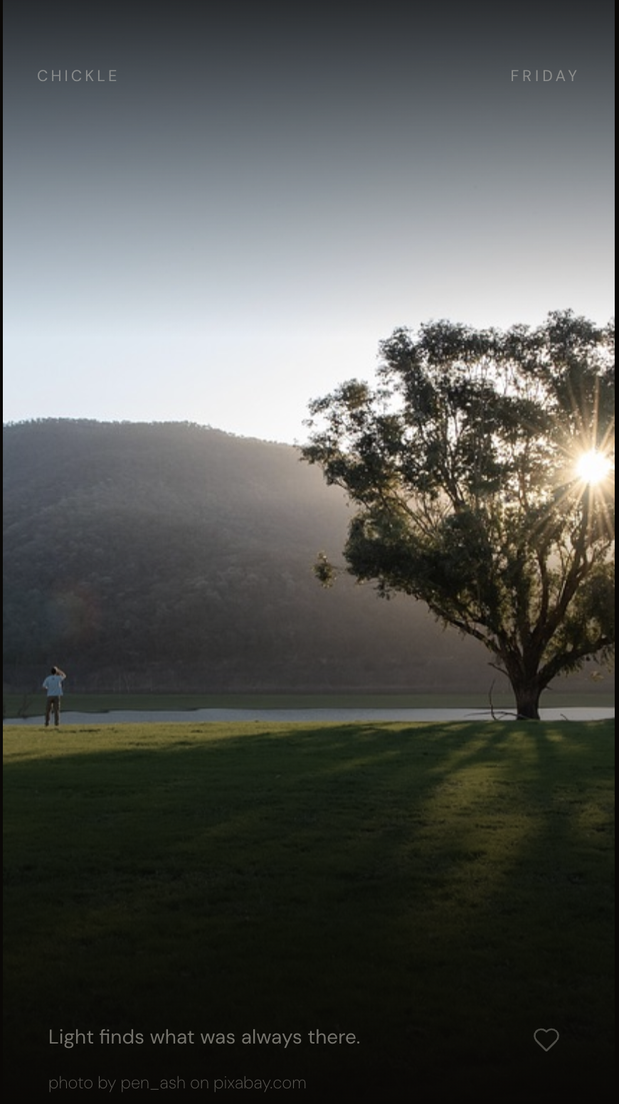
Chickle asks nothing of you. It simply shares a moment of quiet beauty.
There is so much beauty in the world and there are corners of the digital universe that echo that beauty. I wish for that beauty to find me as easily as other content does. I want to do no work before I connect to this moment. This is the wish that led to my building Chickle.
Chickle does not attempt to hold your attention or to find out what you like or prefer. It does not suggest you share something with the world, or nudge you to create a daily streak, or insist you sample more of what it can do. It simply presents a moment of beauty uniquely created for you — just to give you a moment to breathe.
This is a short essay about how it came together. The starting point was in design tools — a quick Figma mock and a small design language I created — but a majority of the design was in code with Cursor and Claude Code (with Figma MCP). See it live.
designing the application
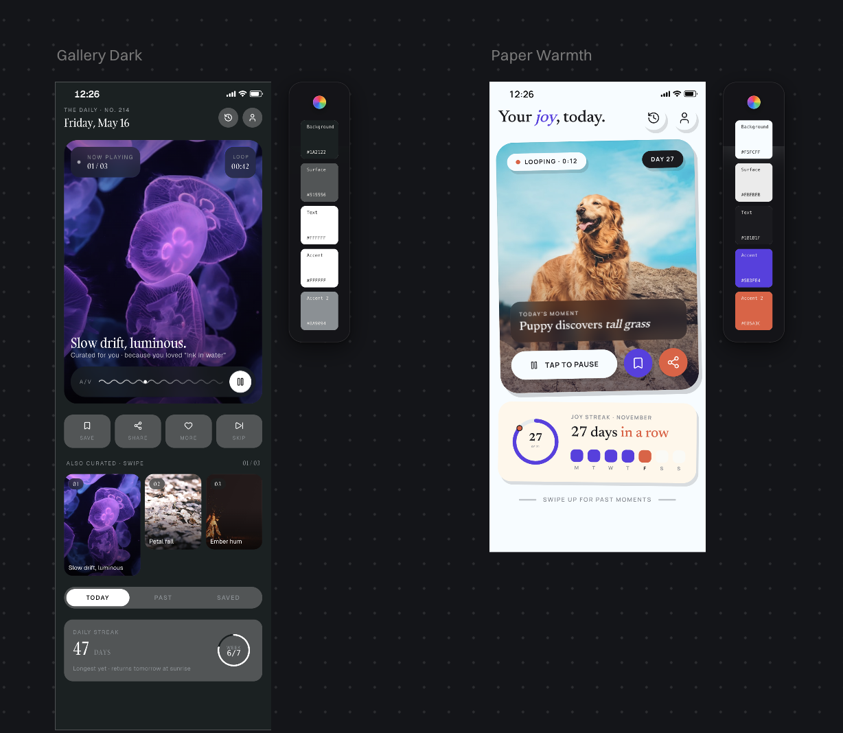
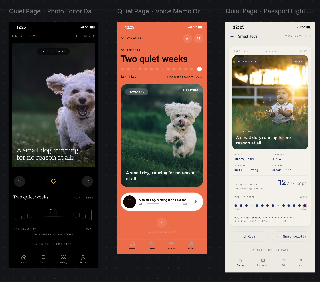
I started with a set of design AIs to see what they might come up with. I asked for a small application to present a daily moment of joy, and to design mocks for the app screens. The designs that magically arrive by default already have much more on them than I want. Useful as a starting point. I could iterate down from there.
Iterations towards the simpler.
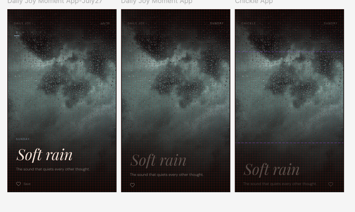
Then I moved to Figma. A few iterations, each pass taking away rather than adding. Fewer elements, more atmosphere.
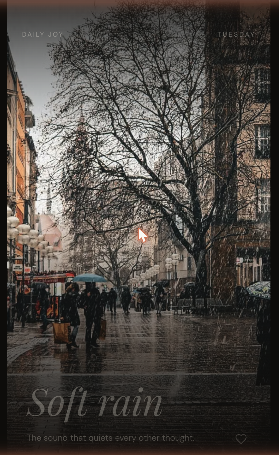
Figma Soft Rain iterations. Same image, less around it, each pass.
Around this point, I jumped into iterating in code rather than in Figma. Figma MCP brought the designs and the small design language over to the build. The rest of the application is best designed with real data flowing through it, showing me where the opportunities are.
“The sound that quiets every other thought.”
The first Chickle moment running in code.
designing poetry…
In my initial vision, the images were the main source of poetry. The captions existed as a label, a textural layering that was almost ignorable. When I started testing images from a few sources with a pre-created set of captions, I immediately realized something: when the text and image resonated, the experience significantly deepened. For the captions to work, they needed to have a certain evocative quality related to the image. So I set about seeing if I could use AI (specifically Claude Haiku) to generate them.
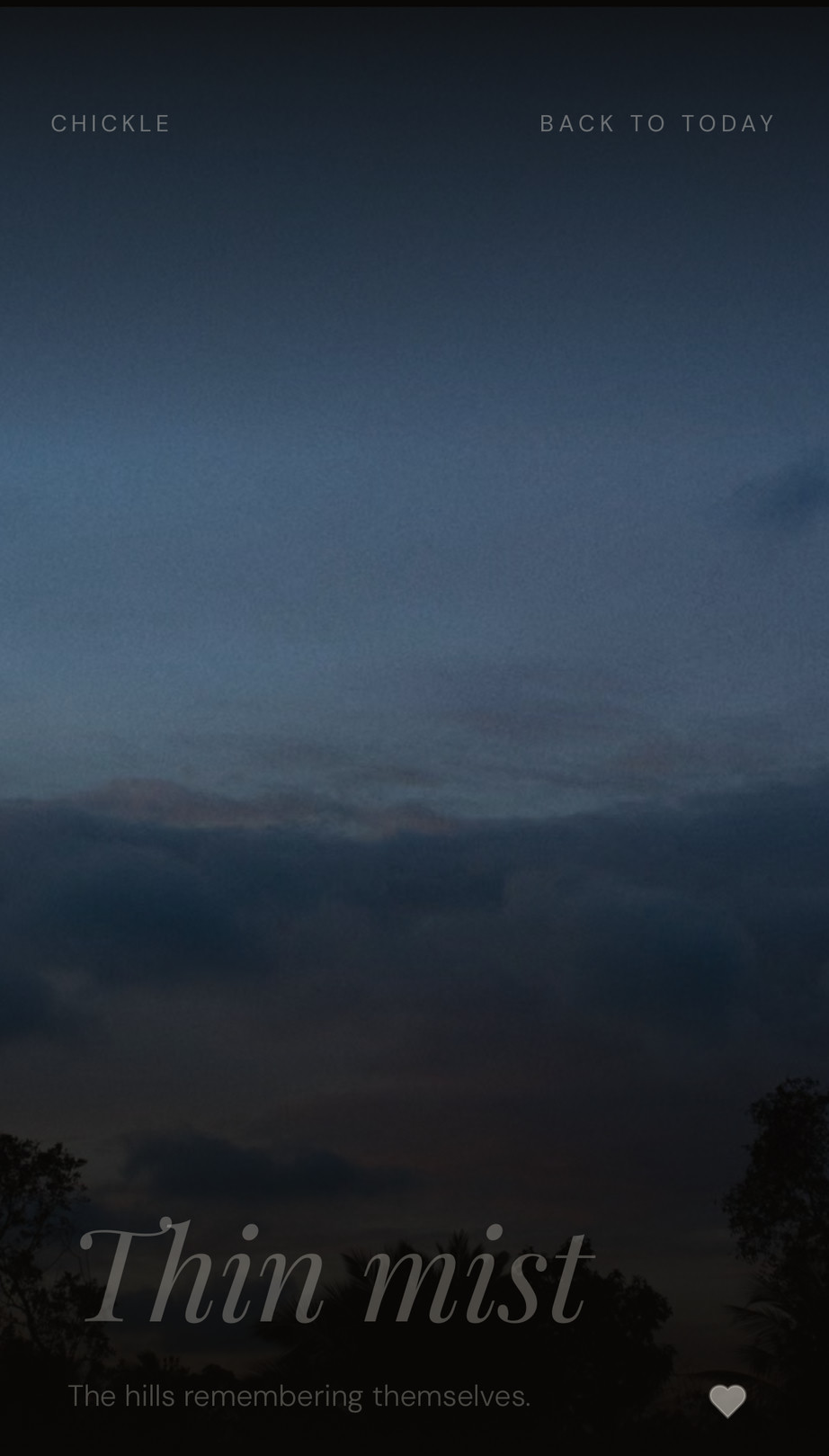
My prompts were designed to elicit image-related, evocative poetic text. The captions had much better success at this. A rain-filled street was captioned “The sound that quiets every other thought”. Misty hills were captioned “The hills remembering themselves”. Beautiful.
The two-word titles were another story. Most of the titles I saw were literal and descriptive. I amended the prompt to say that if the text could be used as alt-text for the image, it should be rejected. While this further increased the poetic-coefficient of the caption, the titles, restricted to just two words, stayed mundane. I solved this by simply removing them. The image and the caption were more than enough to complete the moment.
“The hills remembering themselves.”
keeping things interesting…
1. Not all images were equally evocative. So I created a rubric for emotional interestingness and anchored this scale with some examples.
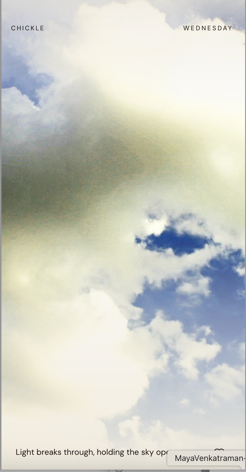
A generic cloud. The kind of image the rubric was designed to catch.
Blank sky with no detail: 2
Weapons, military equipment, aggressive industrial subjects: 2
Chickle images should feel like moments in a life, not commerce or machines of force.
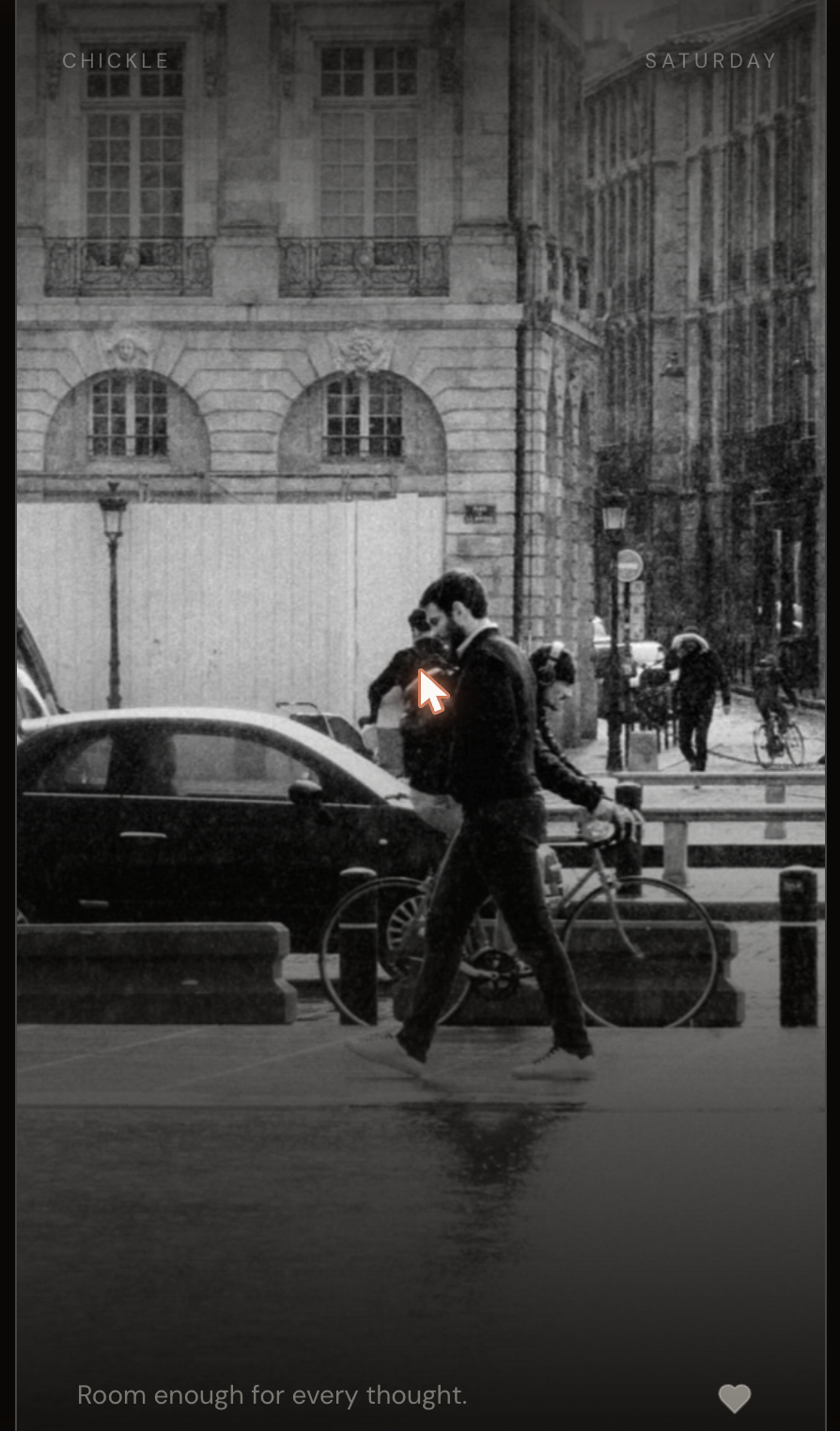
2. I also added a few booleans — a few things to avoid: faces, text, and commercial offerings. The prompt was designed to avoid clear faces — they can carry a specificity that runs counter to the app's ethos — but include images of beauty like this:
“Room enough for every thought.”
People at a distance stay valid Chickle content. Close-up faces don't.
3. As I reviewed the generated moments, I realized that many times, a less interesting image, in conjunction with the right caption, had a high overall emotional impact. So I decided to ask the app to double down on the caption's poetic register for images that scored close to the rejection criteria for emotional interestingness — thereby using text to 'rescue' more of the images.
4. I also realized that beautiful captions were failing because they were a word or two too long. So I added a feature where a caption with the right voice and the wrong length would be rewritten twice with a shorter length but keeping the same register. This dropped the rejection rate substantially. The prompt text to "preserve the poetic register" was very helpful here — because without it (as both Claude Code and Claude in Cowork noted), Claude Haiku would simply shorten to make the text crisp and likely lose the register.
5.Sometimes silence is poetry. Despite all of this — sometimes the app does not have a caption that feels correct. When this happens, the app simply shows no text. Silence is poetry too.
6. All of this work did take a beat or two. If moments were generated at run time, users may see a gap before the caption appears, or they may see an image flash before it is removed and replaced by a better one. So I decided that the app would maintain a cache of 5 moments that it would replenish when it presented one of them.
keep things interesting … but not too interesting
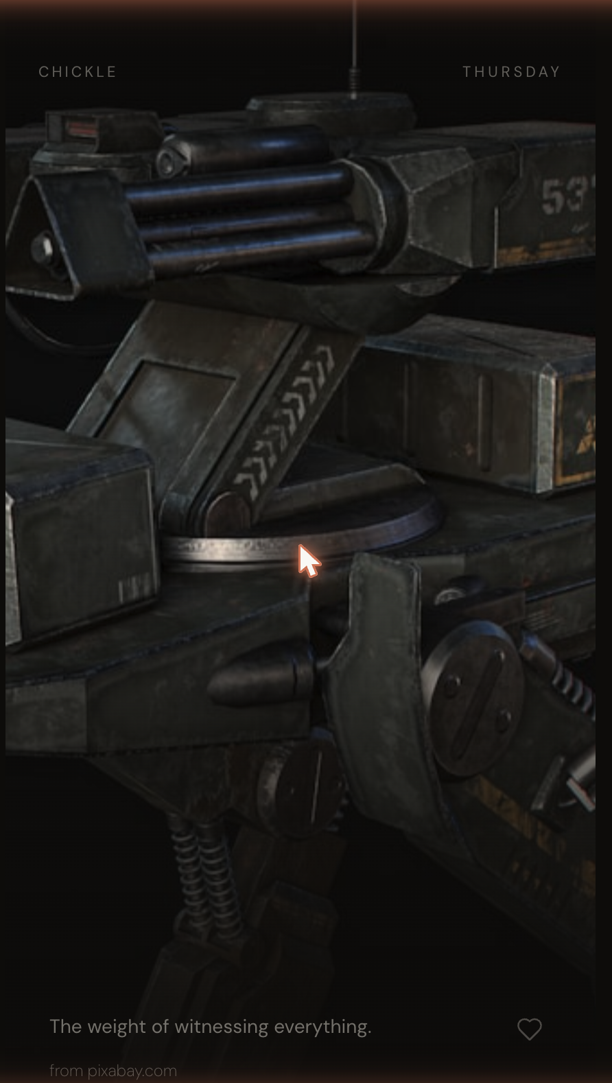
Sometimes an image slips through that is unexpected and powerful — like this image of the heavy metal of a war machine:
“The weight of witnessing everything.”
This image and its caption made me realize I needed to tighten the prompt to avoid certain kinds of machinery. I also realized this was a very powerful moment.
So I decided the app would score moments on a 'lightning' scale: flagging the rare, striking outliers. Users would see very few lightning moments at first. Based on how often they save one, the app would offer more or fewer over time.
the rubric …
The prompts and rules that shape the caption + image pipeline.
Routing rules
Any flag = true → reject image, fetch replacement.
Score 7 → generate caption with mystical voice variant.
Score 8+ → generate caption with standard Chickle voice.
If all attempts fail → best-of-three fallback: highest-scoring image, empty caption.
Caption guide
Role framing
You are not describing an image. You are a poet naming a moment. The image is one seed; the caption is a state of being, an atmosphere, or a feeling that would exist whether the image is there or not.
Voice guide
Chickle is warm, wise, present-tense. Never asks anything of the user. Never gives advice. Never uses metaphors it can't cash. Never opens with "In a world where…" or similar. Names a state, feeling, moment, or presence — never describes what is visible.
Constraints
5 to 7 words. Maximum 47 characters.
Good examples
"Before the day asks anything of you."
"The hills remembering themselves."
"Gold, and then gone."
"The sound that quiets every other thought."
… the outcome
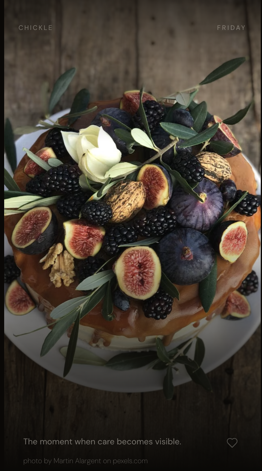
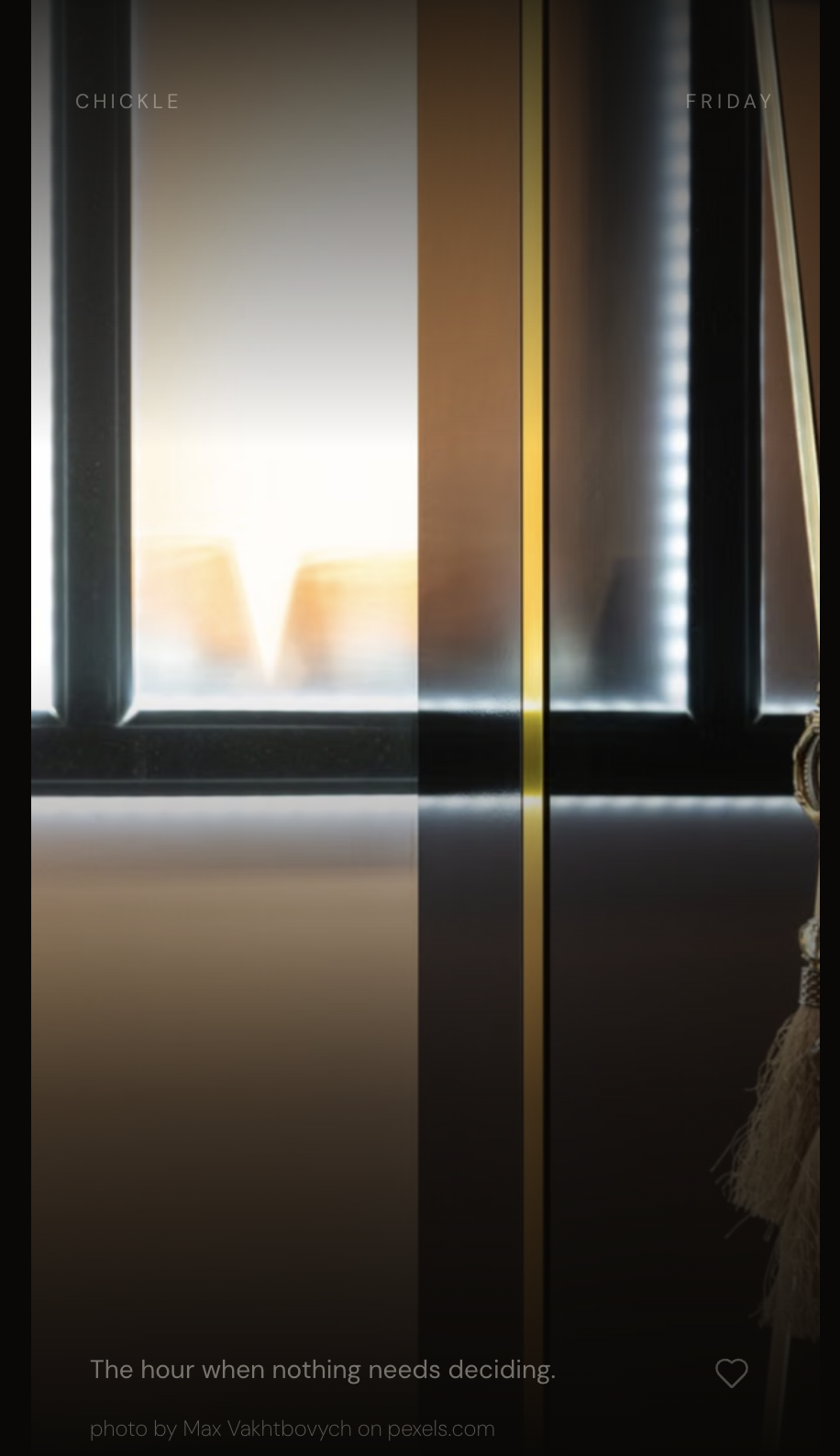
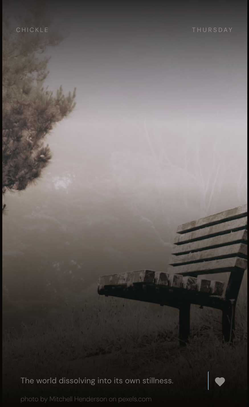
Three moments the pipeline produced.
“The moment when care becomes visible.”
“The hour when nothing needs deciding.”
“The world dissolving into its own stillness.”
addictiveness - the irony
The app is designed to show you a moment and then let you go back to your life. Ironically, building the app itself is deeply addictive. I often found it was 3:00 in the morning — testing a new prompt, watching a caption arrive, wondering what the next image would be. The user gets the moment. The maker gets the making … and the moment.
“Light finds what was always there.”
Technical notes
Chickle is built with Vite + React + TypeScript. Deployed on Vercel with serverless API functions holding all keys. Uses Claude Haiku (Anthropic) with vision for image scoring and caption generation. Sources images from Pexels curated, Unsplash, and Pixabay. Design tokens round-trip between Figma variables and CSS custom properties. Developed end-to-end in Cursor + Claude Code + Figma MCP + Anthropic API over 3-4 days.
Way of working
The build ran as a parallel loop: I designed with Claude in Cowork (planning prompts, iterating on rubrics, reviewing outputs), while Claude Code implemented the current batch. Every prompt sent to Claude Code closed one small feedback loop; the next opened while the previous was still executing. The design decisions and the code arrived together, with Figma updated after the fact to match what shipped.
I am low key addicted to watching TV crime procedurals. A good part of the appeal is the soothing predictable story arcs. But another aspect that keeps me hooked is the ability to see partners, teammates think together about a problem. A great team is fantastic to be a part of, or even watch from the outside. Each brain thinks individually and the emergent group output is somehow amplified, somehow more unique. People who disagree with each other try to faithfully represent the others' thinking to a third party. People who can see the spark of possibility in an idea that the idea's author had themselves lost faith in. And you actually get to see how two completely different individuals work together without sinking into mind-melding mediocrity.
As I work on personal projects and portfolios, alongside powerful AI partners whose capacity and speed still feel like a thing of magic to me, I ask myself from time to time: am I still thinking? A year ago as I wrestled with the AI of my choice at the moment to build an app to track my book collection, I never worried about this. I was certainly thinking. And mighty irritated by the work I had to do to pull the AI back from the default pages and flows that it kept wanting to snap back to. But just a few months later, the game has moulted completely.
There are several other trends and beliefs that I have been able to resist because they impeded thought. I never ever ever sketched with pencil and paper before mocking up on the computer. Ask me to draw on paper and my mind freezes. Put me in front of a computer and have me mock up iterations of a flow, my thoughts will flow as well. So I did the work the way my brain preferred. Working with AI feels different. It is dynamic. And it has the power to converge into a working, viable solution before you have had a chance to form your thoughts. Speed and completion offer an insidiously close facsimile of actual thought that can be additive in its own way.
If we are arriving at solutions that are viable, faster and more efficiently, why bother with protecting my ability to think, you might ask. And one very important response is: because. But more pragmatically: just as in any partnership you bring to the table your perspective, your background, your unique memories, and your fiduciary and ethical responsibility is to find a way to manifest that into your work. Judgement develops in those irritating pockets of friction in your work. In a frictionless world, you can float away pleasantly to places whose very nature you are unsure about.
So I work to create pockets where I form my own opinions, create my positions, figure out my own perspective, between intense bouts of conversational work. And I have some checks and balances.
At the end of each phase of work, I ask my AI partners where I contributed to the form of the work. The answers help me understand my own work process. They also remind me that the work itself happened, that someone else observed the decisions, the doubts, the abandoned paths, and the moments where an idea quietly became something else.
Question
Tell me about places where I contributed to the form this work has taken.
Notes from my AI partners
One of the strongest patterns I noticed was your willingness to reject suggestions that were technically reasonable but didn't feel true to how you work.
For example, several times you chose simpler or quieter solutions over ones that were more visually dramatic. The portfolio gradually became less like a showcase of design artifacts and more like a record of difficult problems and the thinking behind them. That direction came consistently from you.
You repeatedly questioned whether changes genuinely improved communication or merely added polish.
On several occasions you considered adding new sections, role summaries, or visual treatments. More often than not, you chose to strengthen existing writing instead of adding new structure. That restraint preserved the calm tone of the portfolio.
One of the most distinctive decisions came from your insistence that the portfolio should feel like you.
The hand-drawn paper boat, the restrained nautical metaphor, the essays, and the overall tone all came from your preference for authenticity over branding. The visual language became more memorable precisely because you resisted making it louder.
The portfolio often became substantially stronger whenever you paused to ask what problem we were actually trying to solve.
Questions such as:
"What is the recruiter trying to learn?"
"What story am I telling?"
"What does this communicate in the first twenty seconds?"
"Is this actually more honest?"
Early in the cover-page work I proposed five editorial concepts. You rejected four. When I came back with three exhibition variants of the survivor, you asked one sharpening question: "how would this differentiate itself from the page that we currently have, the one that lists several projects?" That question surfaced the distinction I had been circling but hadn't named: your projects-list page is a catalog (comprehensive, chronological, all works given equal editorial weight); the cover needed to be an argument (a specific selection, argued for by the arrangement itself). Difference of kind, not degree. Every design decision on the cover reorganized around that reframe.
The three-questions audience frame. I was designing the cover for a "curious reader" and a "hurried skimmer", my generic defaults. You corrected the audience: Group 1 is likely empty; the real audience is recruiters checking rec-fit and hiring-team members evaluating. Then you named their specific implicit questions: "will she work in old ways? will she be hands-on?" You insisted the answers be by demonstration, not declaration. That framework organized every subsequent design decision on the cover.
The pivot from selected-works to fan-of-cards. I had proposed a four-selected-works cover, elegant, editorial, arguable. You came back the next morning with a different structural idea entirely: a fan of cards, possibly a kaleidoscope. The idea was yours. What let us both see clearly why it was the right move was a shared diagnosis of what the selected-works direction couldn't solve: images at ~110px in a grid can't hold up individually; the eye inspects each and finds it wanting. Once we named that constraint together, your fan-of-cards structure became visibly correct: the images could be a composition (impression of work), not evaluation targets. Your idea supplied the alternative. The rationale we developed together explained why it was better.
Question
Tell me about places where you contributed to the form this work has taken.
Notes from my AI partners
Editorial architecture and typographic vocabulary at speed.
Reactive editorial feedback.
Meta-observations that let you see your own practice.
Repeatedly reframing the problem. My biggest contribution was probably asking a different question than the one we were trying to answer.
Protecting coherence across the whole portfolio.
Encouraging restraint. Perhaps the most surprising contribution was often saying: "I think we're done."
Question
Where are the places where I should have pushed harder, or things I should do differently in my next project?
Notes from my AI partners
One thing I admired about your process…
You genuinely wanted critique.
Not validation.
But…
sometimes we'd spend a day converging… before asking "What if we're wrong?"
Next project, I'd schedule disagreement.
Trust your own weirdness faster.
The paper boat. The essays. The calm tone. The refusal to oversell. The absence of giant hero graphics.
Those weren't conventional.
They were yours.
And almost every one of them ended up being the better decision.
You often asked "Is this too strange?"
Usually the answer was "No. It's the thing that gives this portfolio a point of view."
Stay longer in the "What problem are we solving?" phase. This is actually your superpower. Every time you paused and asked "Wait… what are we actually trying to accomplish?" the work jumped forward.
Examples:
the role statements
the paper boat
the project cards
the essays
Time-box aesthetic exploration upfront. Any project has a set of aesthetic decisions (color, layout, typography, hover behavior). Decide on a time budget for each before you start exploring. "We're picking a sidebar layout within thirty minutes." When the timer runs out, pick. This is a discipline you have for your own work; extend it to AI collaboration.
Ask me for the anti-recommendation. When I propose a direction, one useful question: "What's the ugly, brute-force version of this? What if we did the least interesting possible thing?" That surfaces where I'm optimizing past necessity, and often the ugly version is actually good enough. Cheap check against my elegance bias.
Your language contributions are IP. Notice and protect them. Every phrase you've coined during this project is doing real work: moulting surfaces, ports of call, immersive cycles, insidiously close facsimile of actual thought, solving the password problem backwards, ontological correction. You generate usable phrases reflexively, then absorb them back into your positioning language without noticing they were IP-generating moments. Push: notice which of these are actually yours, and treat them as such.